Hi, it's me again, Susan. Memorable Seasons is really truckin' along with its Throwdown Contest - here we are at week #4, and we've seen some wonderful layouts, cards, tags, and bookmarks as a result. I'm bringing you the next page challenge.
Lately I've been seeing the oddest thing on restaurant menus - Fried
Chicken and Waffles. What?!? I've never ordered it and, quite frankly,
I can't see drowning perfectly good fried chicken in maple syrup, but
then who knows? It just might be good.
For now, though, I think I'll indulge in this tasty trend with an inedible scrapbook layout! Here's my example for which I used my June DT kit "Destinations" by LilyBee Designs.
Here's the throwdown recipe you need to follow for Fried Chicken and Waffles:
Waffles - layout must be done in a grid format
Syrup - the color brown must figure prominently on your page
Crust - in a really good fried chicken recipe, the crust needs to hold onto the meaty parts. So, I want to see some buttons holding your page together. (Ha, ha - that was really a stretch, wasn't it?)
I hope you have fun with this new throwdown challenge!
Friday, June 28, 2013
Thursday, June 27, 2013
It's been a BLAST Memorable Seasons!
Hi Everyone! Carol with you for the last time! This is my "farewell", "goodbye", "it's been awesome" post for the end of my design team term here at Memorable Seasons!
I was debating with showing you my favorite layouts that I created while I was on the design team, but then I decided to let my brilliant words and verbal intellect just amaze, delight, and capture your attention while allowing your visual senses to have a little rest!
It's been an honor to represent this site. While I have done so, I've always had a great time. The reason for that is all of you. YOU inspire me. My hope is that at the very least I've entertained you, enabled you way too much, and hopefully have INSPIRED you! From comments made, I have become known as the scrapper who sews on everything, and apparently some of you find it slightly humorous and quite delightful that I take so many self-portraits with my gorgeous daughters! It is my belief that I look better while sandwiched in between such stunning beauty! Try it for yourself, you'll be amazed! I'm happy to be known for both of those things, because they both make me extremely happy and bring me joy! Yes, I know it's weird that a sewing machine brings me joy, but it does, I can't help it! To know me is to know that my daughters are pretty much everything to me. In that regard, I am the luckiest woman and mom in the whole wide world!
OK, so wrap this up Carol! It's been FUN! I'm not going anywhere. This site has been my "home" for a long time now, and that's not going to change. Now instead of issuing challenges, I get to participate in the challenges, and to that I say: Bring. It. On!
Thanks Memorable Seasons and all of the Memorable Seasons members! You're some of my favorite online people! Don't ever change!
Monday, June 24, 2013
Appetizer Challenge #4
Hi, everybody! It's Susan here with your next Memorable Seasons Appetizer Challenge.
If I had my way, every meal would begin with dessert!!!! And one of my all-time favorite desserts is Chocolate Mousse. Yum-eeee! Light, fluffy, super chocolatey, topped with whipped cream and toasted almonds. There's nothing better!
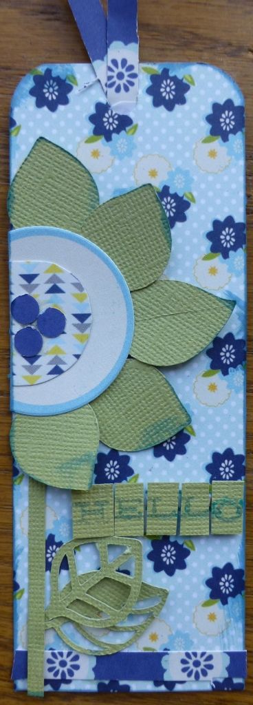
My challenge is for you to make a bookmark. If you are not a reader, you could make one for your favorite recipe book.
I used my June DT kit, "Destinations" by Lily Bee Designs which has a travel theme. I made a bookmark to use while reading on vacation.
So, here's the recipe you need to follow:
For that extra rich chocolatey taste, nothing adds richness to a paper project like EMBOSSING.
Chocolate mousse is always "stamped" with a topping of whipped cream, so I want to see STAMPING.
And lastly, sprinkle your mousse with almonds, which in this case are WORD STICKERS.
Saying Goodbye
To all my friends at memorable Season--
I would like to take this moment to say thank you for the opportunity to be a part of the Design Team for the past six months! I hope I have inspired you. I can tell you, that each of you has inspired me!! I have enjoyed the chance to work with the wonderfully talent Design Team and I would like to thank Wendy, Susan, Megan, Jennie and Carol!! It is so much fun being a part of Memorable Seasons and while I will not be on the DT, I will still be here.
Thank you so much!
Jean
Friday, June 21, 2013
Throwdown Challenge - June 21
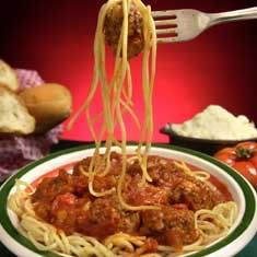
Now that we have had our appetizer, it is time for the main course. This week we are going italian!!
DH is italian and there was nothing like his grandmother's homemade sauce and his mom's meatballs. We even had pasta on Thanksgiving!!!
The recipe I want you to use is this
spaghetti: strips of paper - can be different sizes, punched, pattern or plain
meatballs: circles - buttons, die cuts, brads, etc.
sauce: paint or mist and be messy!
Here is my plate --
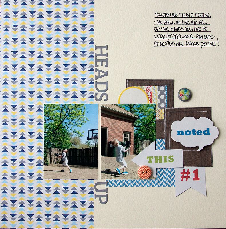
I used Lily Bee Destination to document my son at his new job. My husband stopped by and took a few pictures:) Sketch from Pagemaps!
Please upload your layouts to the gallery by June 26 and link back to this thread.
Have fun!!
Wednesday, June 19, 2013
Appetizer Challenge
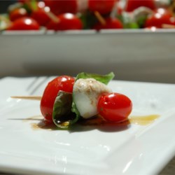
Since summer is in full swing, what could be better than a bite size caprese salad. What is that you ask?
It can be as simple as a toothpick with cherry tomatoes, mozzerella and a piece of basil.
My challenge for you is to make a tag with the foillowing recipe
Circles to represent the tomatoes
Squares to represent the mozzerella
And leaves for the basil
Here is my example
Create a new tag, upload it to the gallery and link back to this thread by June 26!
Enjoy!
Friday, June 14, 2013
Hi there! Jennie here with a brand new challenge for you today!
The challenge for today is an easy one -- but I can't wait to see what you do with it!
PIZZA! So many different bits and pieces to consider with pizza: crust, sauce, cheese, toppings and seasonings -- YUM!
In this page (layout) challenge -- I want you to:
Pick your favorite crust, either standard (white or off white cardstock base) or whole wheat (kraft cardstock).
Add the sauce (patterned paper) -- use three different ones. Each of these represents tomatoes, garlic and basil.
And sprinkle the cheese. (add journaling lines to the page!) A lot or a little is up to you.
Things to consider:
We didn't do toppings. That's up to you! (Embellishments) Also, a pizza is usually round and slices of pizza are often triangles. You could try and incorporate these things into your design, if it tickles your fancy!
here's my take:
Add your page by June 19 to play along!!
Tuesday, June 11, 2013
Jennie's DESSERT Throwdown challenge!
Hello there! Jennie here with a challenge for you!
This challenge is right up my alley, DESSERT!
I'm challenging you to make a TRIFLE. Yes, a trifle! Traditionally, a trifle is a layered dessert made with cake, custard, gelatin and whipped cream. Nowadays, there are many different variations on trifles.
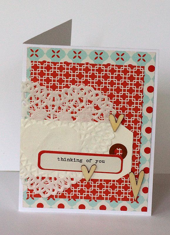
So, I'd like to see you do some LAYERING, just like a trifle. Create a card or a tag with a minimum of 3 layers, not including the base. You can use anything -- die cuts, tags, patterned paper, doilies -- skies the limit!
Here's my take on the challenge:
Now, show me what YOU'VE got. Post your take on this challenge here by June 19!
Friday, June 7, 2013
Carol's Main Course Throwdown - Week 1
Alright . . . you've hopefully been working on the 1st appetizer challenge, your appetite is revved up, and you're ready to go!
Are you ready for the 1st MAIN COURSE THROWDOWN CHALLENGE!?!
HERE WE GO!
I'm making a conscious effort to eat healthier, and it's working for me so far! I love this site: Skinny Taste.
This not only looks good, it IS good:
Chicken Fajitas

Chicken Fajitas! YUM!!!
(1) Chicken and tortillas are both pale in color. I want you to use a very pale neutral as your background. It doesn't have to be plain cardstock, it can be a ledger sheet or a small patterned sheet, as long as the overall look to it is pale and neutral. Tortillas are also round, so if you would like to also add a circle to your layout, go right ahead! However, the pale color is the only requirement for this challenge!
(2) Red and green peppers cut into strips. I cannot eat green peppers, because they are the one food that seriously gives me heartburn! In this recipe, you can use one or both, but you must have some kind of red or green strip of paper. You can use any other colors you want too, but you must use red or green strips of paper!
(3) Lime juice! In my opinion, no chicken fajita is complete until you put freshly squeezed lime juice on it! So, I want you to add a "juice". A mist, a paint splatter, a confetti splatter, dots of Stickles . . . something!
Here's my example:
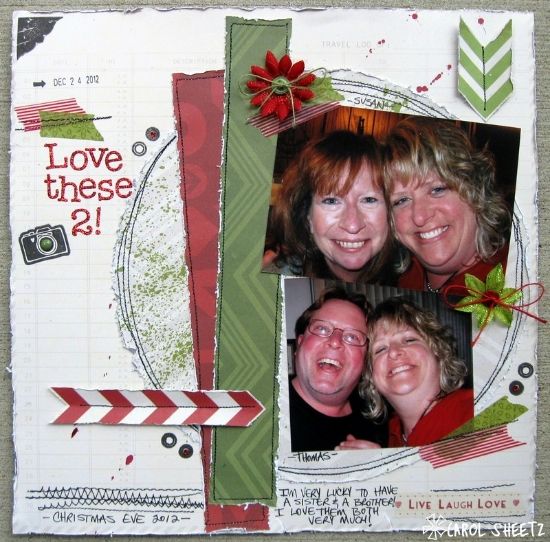
(1) Pale in color = both my background and my circle are pale in color. I also added a big circle. I love the two neutrals stacked on top of each other!
(2) Red and Green paper cut into strips = I had fun with this! This is a TRAVEL collection, and yet I created a Christmas layout! How fun, crazy, and versatile is this!?! I had a lot of fun with some washi tape and with chevrons that I made into arrows! Red and Green touches are quite prominent on this layout. Remember, you only need to use red OR green. You do NOT need to use both!
(3) Lime juice = Mister Huey's on my tortilla! I used an awesome green mist on my circle layer! I also used some red splatters on my background sheet!
I used my AMAZING June DT kit which features Simple Stories Urban Traveler! Love this collection!
Create a NEW project for this Main Course Throwdown!
Upload it to the gallery and link it back to this thread in the forum!
Entries are due by Wednesday, June 12th!
HAVE FUN!!!
Are you ready for the 1st MAIN COURSE THROWDOWN CHALLENGE!?!
HERE WE GO!
I'm making a conscious effort to eat healthier, and it's working for me so far! I love this site: Skinny Taste.
This not only looks good, it IS good:
Chicken Fajitas

Chicken Fajitas! YUM!!!
(1) Chicken and tortillas are both pale in color. I want you to use a very pale neutral as your background. It doesn't have to be plain cardstock, it can be a ledger sheet or a small patterned sheet, as long as the overall look to it is pale and neutral. Tortillas are also round, so if you would like to also add a circle to your layout, go right ahead! However, the pale color is the only requirement for this challenge!
(2) Red and green peppers cut into strips. I cannot eat green peppers, because they are the one food that seriously gives me heartburn! In this recipe, you can use one or both, but you must have some kind of red or green strip of paper. You can use any other colors you want too, but you must use red or green strips of paper!
(3) Lime juice! In my opinion, no chicken fajita is complete until you put freshly squeezed lime juice on it! So, I want you to add a "juice". A mist, a paint splatter, a confetti splatter, dots of Stickles . . . something!
Here's my example:

(1) Pale in color = both my background and my circle are pale in color. I also added a big circle. I love the two neutrals stacked on top of each other!
(2) Red and Green paper cut into strips = I had fun with this! This is a TRAVEL collection, and yet I created a Christmas layout! How fun, crazy, and versatile is this!?! I had a lot of fun with some washi tape and with chevrons that I made into arrows! Red and Green touches are quite prominent on this layout. Remember, you only need to use red OR green. You do NOT need to use both!
(3) Lime juice = Mister Huey's on my tortilla!
I used my AMAZING June DT kit which features Simple Stories Urban Traveler! Love this collection!
Create a NEW project for this Main Course Throwdown!
Upload it to the gallery and link it back to this thread in the forum!
Entries are due by Wednesday, June 12th!
HAVE FUN!!!
Thursday, June 6, 2013
Carol's Appetizer Throwdown - Week 1
LET'S GET THIS THROWDOWN STARTED!!!
To get you started and in the Throwdown spirit, we're starting with an appetizer. What that means is that you are making a smaller project! Make a card, a tag, a bookmark, something small! I decided to make a wall hanging. It's hanging on an armoire handle in my family room!
Grilled Potatoes

(1) I love a cute crinkle cut! Dust off that paper crimper! I want to see crinkles! If you don't have one, feel free to use fabulous corrugated paper! Or cardboard! Or accordion fold back and forth and make your own crinkles! I would even consider scrunched ribbon to be a little crinkly!
(2) I love the cup of ketchup in the photo, so add a splash of bold COLOR!
(3) Potatoes are pale in color wrapped around a darker color outside color! Interpret that any way you wish!
Here's my example:

(1) Crinkle cut = cardboard backing
(2) BOLD color = flowers, colorful collection
(3) Pale in color wrapped around a darker color = pale background on top of kraft cardboard
I used my AMAZING June DT kit which features Simple Stories Urban Traveler! Love this collection!
Create a NEW project for this Appetizer Throwdown!
Upload it to the gallery and link it back to the forum!
Entries are due by Wednesday, June 12th!
HAVE FUN!!!
To get you started and in the Throwdown spirit, we're starting with an appetizer. What that means is that you are making a smaller project! Make a card, a tag, a bookmark, something small! I decided to make a wall hanging. It's hanging on an armoire handle in my family room!
Grilled Potatoes

(1) I love a cute crinkle cut! Dust off that paper crimper! I want to see crinkles! If you don't have one, feel free to use fabulous corrugated paper! Or cardboard! Or accordion fold back and forth and make your own crinkles! I would even consider scrunched ribbon to be a little crinkly!
(2) I love the cup of ketchup in the photo, so add a splash of bold COLOR!
(3) Potatoes are pale in color wrapped around a darker color outside color! Interpret that any way you wish!
Here's my example:

(1) Crinkle cut = cardboard backing
(2) BOLD color = flowers, colorful collection
(3) Pale in color wrapped around a darker color = pale background on top of kraft cardboard
I used my AMAZING June DT kit which features Simple Stories Urban Traveler! Love this collection!
Create a NEW project for this Appetizer Throwdown!
Upload it to the gallery and link it back to the forum!
Entries are due by Wednesday, June 12th!
HAVE FUN!!!
Wednesday, June 5, 2013
June Challenge 5 - STASH
Today's challenge is all about digging into your stash! I want you to get out those flowers you are hoarding. If you are like me, you are probably saving them! So get them out and put them to good use!!!
Create a layout or two cards and upload to the gallery. Please link to this post Stash
Challenge entries are due July 31st!
Create a layout or two cards and upload to the gallery. Please link to this post Stash
Challenge entries are due July 31st!
Tuesday, June 4, 2013
Meet our June/July MOTM
Hello! My name is Sally Cranney and I've been scrapping for a little over 17 years. I have been married to my sweetheart, MIcah for 22 years. We have 3 great kids: our oldest daughter just finished up her associates degree at Snow College and then we have 2 fun boys ages 16 and 13. They are my main focus in my layouts, though I never scrap in order so you'll see them at all different stages.
Scrapbooking is truly my passion! I love to sit and take pieces and parts and just create! I'm a very linear scrapper...you'll rarely see angled anything on my layouts and if you do it was to follow a sketch as it almost stressed me out. I love mixing patterned paper and love having several on each layout. You'll also see lots of sewing, distressing, pennants/banners and lately mist splattering.
Besides scrapbooking, I love to watch my kids play sports, shop with my sisters, flower gardening and reading.
I'm thrilled to MOTM this month and grateful to be a part of this awesome message board! Thanks!
Thanks for sharing with us Sally, we are so glad to have you apart of Memorable Seasons!
Monday, June 3, 2013
June Challenge #3 - Technique Time
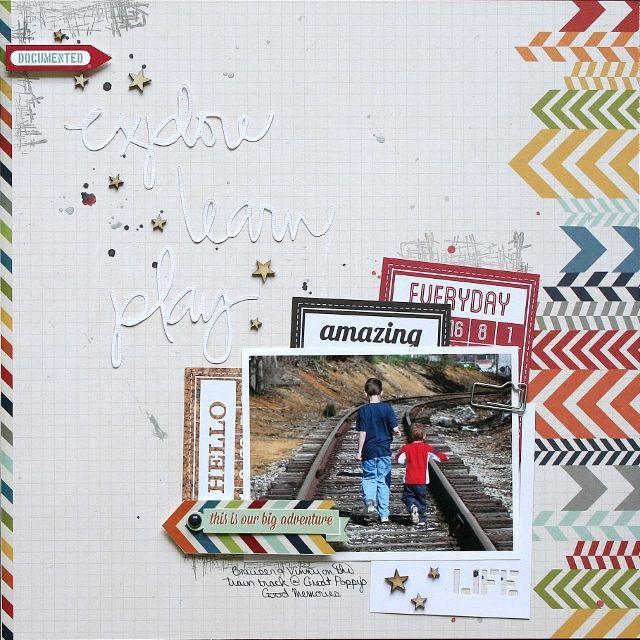
I was assigned the technique challenge at Memorable Seasons this month. I always create with my kit first and then plan my challenges, as I was looking through my work this month looking for something to challenge you all with I realized (yet again) that I love white space! So my challenge to you this month is to create with white space on your layout. Instead of leaving those of you that don't like white space to say this challenge isn't for me I have included some tips that surface on most of my layouts...
2. I like to balance the design on both sides of my paper (or top/bottom) - for instance the paper I chose had the chevrons down the one side of the paper and so I added a strip of paper to the opposite side to keep my design balanced.
3. Use ink/mist/stickers/wood veneers/etc... to fill in some of that white space, but without really adding anything too heavy. I also added the die cut words in white to fill my space - not adding anything to heavy, but something that would catch the eyes.
4. Think diagonally, vertically, or horizontally but fill that area. In this layout I was thinking diagonally and I filled the diagonal completely.
5. And layer - once I had the basic design of my page I then added some stamps in that diagonal area, I layered a few of the Bingo cards, the paper clip and the sticker/brad were also added.
So your challenge is to create using white space, even if that isn't your thing, shake your thing up a little and see what you can do!
*Create a new layout or 2 cards for this challenge.
*Please upload your creation into the gallery and leave a link in this post by July 31st.
Here is the layout I made for this challenge...
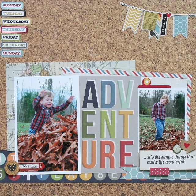
1. White doesn't have to mean the actual color white! If you notice on my adventure layout, I used the cork patterned paper, but I left a lot of the cork showing.
2. I like to balance the design on both sides of my paper (or top/bottom) - for instance the paper I chose had the chevrons down the one side of the paper and so I added a strip of paper to the opposite side to keep my design balanced.
3. Use ink/mist/stickers/wood veneers/etc... to fill in some of that white space, but without really adding anything too heavy. I also added the die cut words in white to fill my space - not adding anything to heavy, but something that would catch the eyes.
4. Think diagonally, vertically, or horizontally but fill that area. In this layout I was thinking diagonally and I filled the diagonal completely.
5. And layer - once I had the basic design of my page I then added some stamps in that diagonal area, I layered a few of the Bingo cards, the paper clip and the sticker/brad were also added.
So your challenge is to create using white space, even if that isn't your thing, shake your thing up a little and see what you can do!
*Create a new layout or 2 cards for this challenge.
*Please upload your creation into the gallery and leave a link in this post by July 31st.
Saturday, June 1, 2013
June Challenge #1 - Sketch time!
Hello all! Megan here and it's my turn this month to issue the sketch challenge. I decided in honor of our own Sally Cranney making it onto the Sketchabilities Design Team, that I would chose one of Karan's awesome sketches to feature this month!
Here's the sketch I picked...
And here is my take on the sketch where I used my Simple Stories 24/7 DT kit. Notice how I adapted the sketch to fit my photos...
I can't wait to see what you all come up with using this sketch!
Remember to...
* Create a new layout or 2 cards for this challenge.
* Please upload your creation into the gallery and leave a link in the challenge thread on the forum by July 31st.
Subscribe to:
Comments (Atom)

.jpg)


