Thursday, February 28, 2013

Photography lesson with Detta - flash

I am back again with another photography lesson. This month, I am going to talk about using your flash indoors. 

You will find many people who subscribe to the "natural light is better" approach to photography and refuse to ever use a flash. I will agree with that philosophy in principle. If you are outside and the light is great, then, by all means, use only natural light to take your beautiful photos. But, what if it is dark outside, or rainy or gloomy or much too cold to venture out there? What if your only choice is to take pictures indoors? Sometimes, you have to resort to using your flash. Personally, I love my flash. I use it pretty much all the time. I like the catch lights it puts in my family's eyes. It helps to create well exposed photos when there is little light. However, there is a right and wrong way to use your flash. I wrangled my daughter, Allison into helping me with this post. I placed her in front of the only plain white wall in my house and took some pictures to illustrate what I am about to show you. This first picture is with no flash. While her face is pretty well exposed with some okay 3d shadows, you can see that her very dark brown eyes look like black holes in her face. There was nothing to light them up.


The next picture was taken with the flash pointed directly at her. You can see her eyes now but look how flat her features are. The prominent features of her face are shiny where the light is reflected back at me. There is also a harsh shadow on the wall behind her. If I had actually used my point and shoot for this picture, she would probably have red eyes, too.


What causes red eye in photos? The red color comes from light that reflects off of the retinas in our eyes. It is usually worse in children and animals whose pupils don't contract as quickly at bright lights. It is at its worst when you use a camera where the flash is very close to the lens on your camera. This is, of course, applicable to just about all point and shoot cameras. Some cameras have a red eye reduction feature where the flash goes off twice. The first time makes your subject's pupils contract to reduce the possibility of red eye. One way to avoid this and also improve your photos is to bounce the light either off the ceiling or a side wall.

The following photo was taken by pointing my flash straight up to the ceiling so that the light falls down on Allison. This eliminated the shadow on the wall behind her and softened the hard light on her face. This did, however, darken her eyes up just a little and puts some shadows under her eyes. It still is a prettier picture than the straight on flash.


On this next picture, I turned my flash to bounce the light off the wall to her right. (my left). In my opinion, this is the best picture. The facial shadows give a nice 3d effect, her eyes have catch lights. The shadows under her eyes are lessened. It's the best case scenario when the conditions are not perfect.


Of course, I was using a DSLR and an off camera flash unit attached to the hot shoe on my camera. The flash is about 6 inches above the lens and the unit swivels so I can turn it any direction I want. I have also been known to put a reflector behind me and aim my flash backwards to spread out the light bouncing back on my subject.  A white wall behind me would work just as well. Just remember that the color of the wall you bounce off on will reflect back on your subject. If you have a pink wall, there will be a pink tinge your photo.

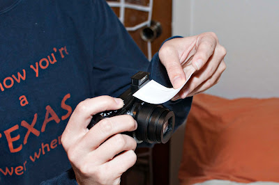
What if all you have is a point and shoot with a pop up flash? There are a couple of tricks you can use to bounce your light or at least diffuse it. You can diffuse it with a piece of tissue paper over the flash. This will soften the light that comes out so it is not as harsh. Here is a picture of my point and shoot with a piece of tissue over the flash. It is just ordinary tissue like you would wrap presents in. You can tape it on or just fold it over like I did here. This same trick would work on your DSLR flash unit if you do not have a white wall to bounce off of.


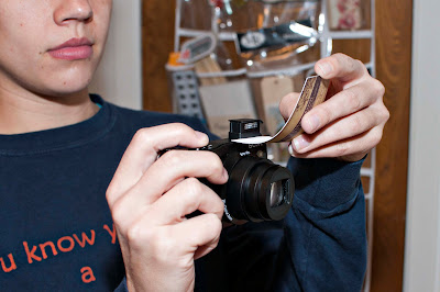
Another trick is to bounce the light using a piece of cardstock or a business card. I actually did this on my DSLR pop up flash before I bought my flash unit. Just hold a piece of white card in front of the flash and bend up so the light bounces off the card and toward the ceiling. 


You could fashion some sort of way to tape it to your flash so you don't have to hold it like this but just holding it like this works in a pinch. 

I hope this small tutorial helped you understand lighting your indoor photos with flash a bit more. Next month, I plan to talk about using available light without flash. Let me know if I can answer any questions.
Friday, February 22, 2013

LSS #3 - LIVE ON THE EDGE!

I am SO EXCITED to be issuing a LSS challenge! I love this contest! I am so inspired by seeing what everyone comes up with for these challenges!

You already gotten your HEART on, and you showed us all who was the BOSS with the embossing challenge . . . are you ready to . . . LIVE ON THE EDGE!?! 

My challenge for you is to LIVE ON THE EDGE!
So . . . what do I mean by that!?! Well, have you ever thought about what you can do to the edges of all of the various elements that you put on your layouts?

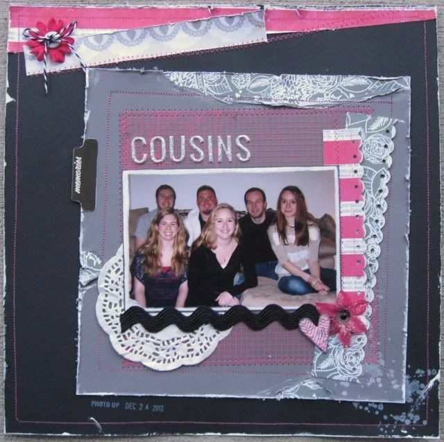
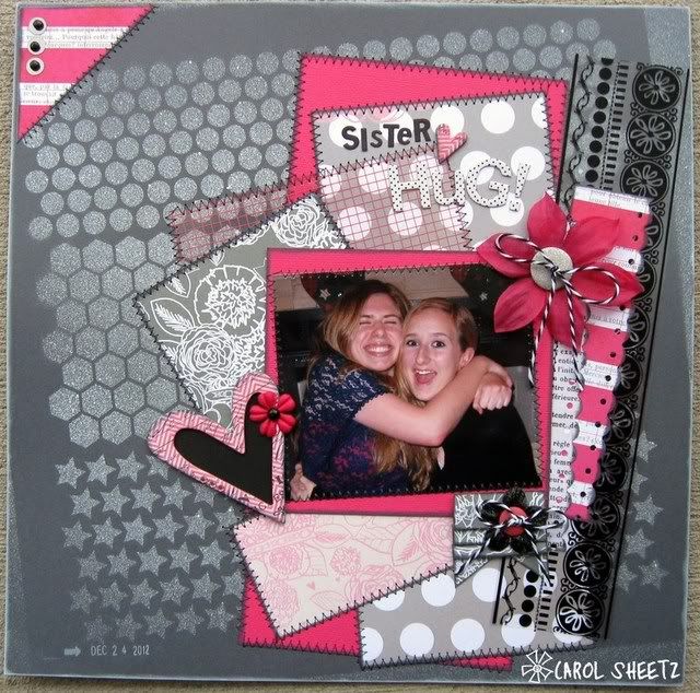
Take a look at my example:

Image

Here are some things that you can do to edges:

* sand them (look at the photo on my layout!)
* sew on them (my transparency)
* distress them (my background sheet and all of my layers)
* paint them (my background sheet)
* do a patterned paper "peek" (take a look at the peeks under the grey square layer!)
* ink them (after I sanded around my photo, I inked the edges)
* frame them (I sewed a frame around my background sheet and the grey layer)
* border punch them (I added two border punched strips to the right of my photo)
* stamp on them (I added a Tim Holtz splatter stamp in white in a couple of spots)
* create visual interest on your background sheet (I really LOVE the fun detail I added along the top edge of my background sheet!!!)

I did ALL of these "edge" treatments on my layout! Can you see them all!?!

There are so many other things you can do! You're limited only by your own imagination!

I am THRILLED, because my example page turned out better than I could have expected! My daughters think this page is just AWESOME, and that makes me happy!

Your LSS #3 Challenge is to LIVE ON THE EDGE!
* Add visual interest to your layout by coming up with fun ways to alter the edges of some of the elements you add to your layout! 
* Tell us the EDGE treatments you added to your layout!
* BE CREATIVE!!!
* Create a NEW layout for this challenge!
* Upload your layout to the gallery and link it back to this thread!
* Have your layout posted by 02/27/13 by midnight!
* Most importantly ENJOY & HAVE FUN!!! 

I cannot wait to see what you CREATE!!! 

Friday, February 15, 2013

Last Scrapper Standing -- Challenge #2! You're the (em)Boss!


Oh yes, you're the (em)Boss! You know what to do and how to do it!

Your challenge is to EMBOSS! That's right -- and I don't even care if you use heat embossing (embossing powder + heat gun) or dry embossing (stencil + tool or with a die cut machine with embossing folders. if you don't have those, even household items will do! keyrings, books, wood and MORE!) -- your choice. Be creative. Have fun and show how you are the (em)BOSS!

Image

I used some Gold Glitter ZING! embossing powder on this page -- I always love the dimension and interest that Zing! gives. 


Want to play along? Then...
* Upload your layout to the gallery and link it back to this thread!
* Have your layout posted by 02/20/13 by 11:59 p.m.

Saturday, February 9, 2013

LAST SCRAPPER STANDING - FIRST CHALLENGE IS UP!

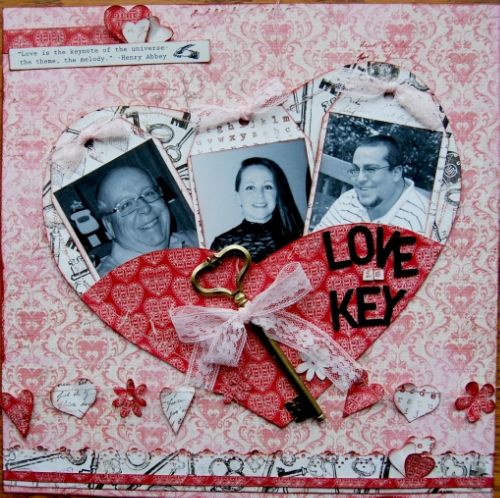
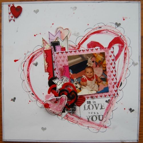
I HEART you. This week's challenge is all about the heart. You must use it as the focus of your layout. Instead of just using it as an embellie use it as shaped journaling, as borders, as banners, shaped out of twine or out of paint! Creativity is key! I have several examples

This must be a new layout created for this challenge. Upload to the gallery and link to the LSS 1 Thread by Wednesday, February 13 at midnight.

Wednesday, February 6, 2013

Are your bags packed???

Because it is time to head off on our island adventure and see who... will be our Last Scrapper Standing for 213.

Do you enjoy the TV show Survivor—well, we here at Memorable Seasons have our own take on the show. It's called The Last Scrapper Standing and we want all you ladies to join us here on our little island for a 6 week adventure that will cause you to scrap your sandals off! 

The DT will issue you a challenge every Friday starting February 8th, you will then have until the following Wednesday to get your layout loaded to the gallery and linked back to the appropriate thread. On Thursday all of us on the island will vote for our top 3 favorites, depending on how many entries we have entered on week 1, a percentage of those will move forward to next week. This will continue until week 5. The last week only the DT members aka THE JURY will vote on the top 3. The layout which receives the most votes will become our Last Scrapper Standing.

So what if you are voted off or what if you don’t want to join in the contest, no problem, because every week ANYONE that participates in the challenges will be eligible for a random prize drawing!
So we encourage you to invite your friends and spread the news because this promises to be the event of 2013, right here on our own little island at Memorable Seasons. So who is ready to be challenged?  Stop by the forum for more details.

See you this Friday!

Sunday, February 3, 2013

Technique Challenge - PAPER LAYERS!


Hi Everyone!  Carol here with today's technique challenge!  I love using different scrapbooking techniques when I create! One of my favorites is paper layering!  I love adding more dimension by layering colors, patterns, and papers that I love!

Here's a layout I created using this technique!

Image

Look at the layers! On top of the cardstock background there is a misted layer and then NINE paper pieces/layers! I love the way this looks!  ♥  Sticking with a paper collection really makes this easy, and double-sided papers are fantastic to achieve this look! Adding smaller/thinner layers is also fun! Check out the Hambly transparency and the two bordered punched layers to the right of the photo!

Of course, I used my fabulous February DT kit which features the gorgeous Pink Paislee Secret Crush collection! I love this collection! I am having so much fun with these papers!

Isn't it also fabulous that my layout totally works with Megan's tool challenge! I got out my fabulous Crafter's Workshop Punchinella template and had fun with my Studio Calico Mister Huey's!

Anyway, your TECHNIQUE challenge is to use paper layers! Layering is fun and easy! It adds so much visual interest to your layout!
- Be sure to use at least 3 to 4 layers!
- Create a new layout for this challenge.
- Upload your layout to the gallery and link back to this thread by February 28th.
- HAVE FUN!  BE CREATIVE!

Saturday, February 2, 2013

Bust Out Those Stencils & Templates!

Hello all! Megan here and it's my day to issue you a challenge! And I was assigned the "tool challenge" for this month. We all have them - stencils, templates, masks - all these great designs to help us add a little flair to our layouts. So my challenge to you is to dust off one of these tools - preferably one you haven't used in awhile (or ever) - and put it to good use. 

I pulled out a chevron Crafter's Workshop template that I've had for months and had yet to use. I also pulled out my super old Chatterbox Doodle Genies that I haven't used in years...
... and decided to use them both on my layout. I used the chevron template and some silver Mr. Huey's mist on my background cardstock and then used the Chatterbox doodling templates and black journaling pens to create some fun whimsical swirls and hearts! Note I also used my February Design Team kit featuring Fancy Pants Love Note collection, available in the Memorable Seasons store!
So, here is my challenge to you...create a layout using at least one template, stencil or mask. Brownie points if you use two of them in two different ways like I did! To be eligible for the prize drawing, your layout must be new and must be posted in the Memorable Seasons gallery and linked to the appropriate challenge thread on the forum by February 28th. Have fun! 

Friday, February 1, 2013

Photography Lesson with Detta - scene modes

Last time we talked about composition. Today, I want to talk about the different scene modes on your camera. Again, these are all pretty common to both point and shoots and DSLRs. You might find them on the dial on top of your camera and it looks something like this
or, as with my point and shoot, they might be found in your menu under auto scenes.

The first one is auto. In the picture above, the auto mode is depicted by a camera. Some cameras have the word "auto." Some just have the letter A. When you shoot in full auto mode, you are letting the camera make all the decisions for you. It decides how much light you need, how fast to set your shutter speed, what white balance to use and whether or not to use flash.Most people leave their cameras on this mode and are perfectly happy with their pictures. However, there are some other choices.

Not shown above is the portrait mode. It is usually depicted by the side view of a woman's face.
Portrait mode is best used when taking a picture of a single person or object with minimal background distractions. It will throw your background out of focus so it does not compete with your main subject. If you are using the portrait mode, try to fill your frame with your subject by zooming in. You might also remember from our lesson on Christmas tree light bokeh that putting some distance between your subject and the background will also help get that creamy background look.


Macro Mode is usually depicted by a flower. This mode is good for taking pictures of small things like insects or flowers. It enables you to focus at a very close distance to your subject, sometimes within a couple of inches but that varies by camera. Check your manual. When using the macro mode, you will need lots of light and a tripod is suggested to minimize camera shake and keep your focus sharp. A good suggestion is to utilize your camera's self timer feature. That gives your camera time to stop vibrating after you push the shutter. If you are able to turn off your camera's flash, you should do so. If not, you could diffuse your flash by taping some tissue paper over it. That much light so close to your subject will give it a flat appearance. It is much better to have lots of ambient light. This mode uses a large aperture to give a shallow depth of field.

The landscape mode is depicted by mountains. When using the landscape mode, the camera automatically sets your focus to infinity. This insures that everything in the shot is sharp from front to back. This is great for shooting scenery outdoors. Because the aperture in this mode is extremely small, the shutter speed slows down to let in more light. You should also use a tripod on this mode in order to keep the camera really still. This mode is also good for shooting through windows and through fences. Because the auto focus won't keep trying to decide what to focus on, you are able to get everything in focus. This is also a case where you should turn your flash off because it will only light up about 10-12 feet in front of you.
Action mode is symbolized with a running man. Some cameras refer to it as the sports mode. Action mode automatically sets the camera's shutter speed and aperture to the ideal settings for action photography. Action photography requires a fast shutter speed and more light to "freeze" the subject's motion to produce a crisp, clean image. This is the automatic mode I would keep my camera on when shooting children and pets because they are constantly moving. It is an ideal mode to use outdoors where the light is bright to prevent a blurry picture.

The Night portrait mode is sometimes depicted like this with a star behind a person or sometimes it uses a moon and a star.   If you were to set the camera to full auto mode, the camera's flash would cause the entire scene to be too brightly lit. Night portrait mode automatically slows the shutter speed to allow time for adequate light to hit the camera's sensor. It also adjusts the timing of the flash to only light up the object or person in the foreground. The slower shutter speed, combined with the flash timing, helps to create more natural looking night shots.Again, a tripod and the timer will help keep the camera still enough and prevent a blurry shot. If you are shooting pictures of people, you will need to ask them to stand very still for several seconds even after the flash has gone out to give the shutter time to close. Otherwise, any movement will cause a ghostly looking blur.

These are the most common modes. Some cameras will also have a mode called beach and snow. It is usually depicted by a palm tree. Mine does not have this. Others might have a fireworks mode and some even have a children mode. The children's mode is simply an action mode.

If you want to experiment with these different creative modes on your camera, you might be surprised at how much different your pictures turn out than they do in auto. Next month, I will discuss flash photography.