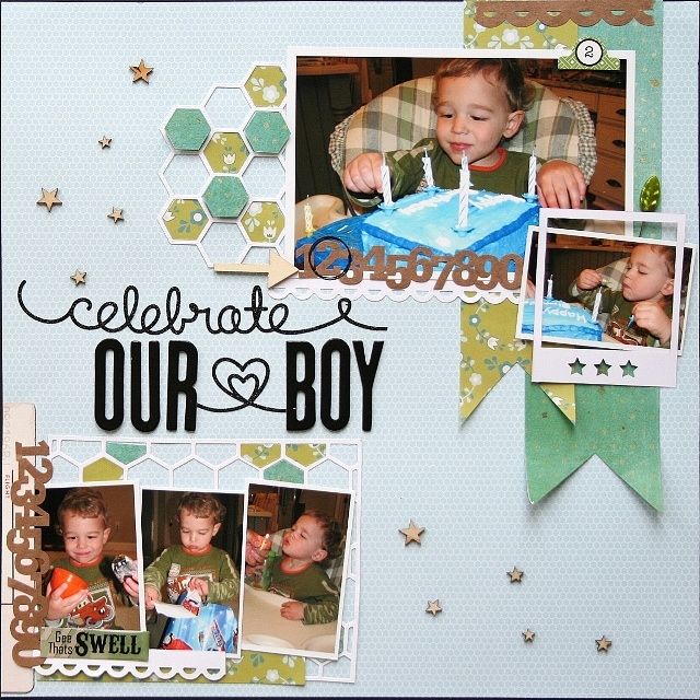
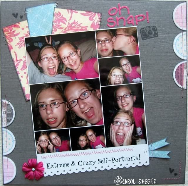
Saturday, March 30, 2013

Documenting March/April

Hello all! 

Megan here and it's time for your next Project 12 / Project Life / Documenting in 2-page fashion challenge. Although I am doing Project Life for 2013, I am still playing catchup on Project 12. But, that's okay because I have all the journaling already typed out on my blog, the sketches picked out and all the photos printed. So when I find good product to use for a P12 spread, I go to town. And, I thought my March mix-up kit would be great for my November 2011 (yep - 2011) layout... 

And here's the sketch I used for reference. This is the actual November 2011 Project 12 sketch... 
I was really unsure about this one because of the sheer number of photos and their tiny size, and then I realized this sketch is highly adaptable. I decided to size my photos to 2x3 and use less of them. And of course, my arrangement is not the same as the sketch but you can definitely see the inspiration I got from it. 

And for those who are doing or contemplating Project Life, earlier this week, I shared some thoughts on the project now that I'm ten weeks in HERE. I am currently working on Weeks 11 & 12 - spreads are sketched out and photos are printed for both so I am making progress. I hope to share them in the upcoming week but in the meantime, here's my week 10 spread that I posted in the gallery a couple weeks back... 

So what's your challenge? 
(1) Create a layout based upon the sketch above or in the Project Life divided page-protector fashion, and... 
(2) Upload it to the gallery with a link to the challenge thread in the forum by April 30th to be entered in the monthly prize drawing. 

Can't wait to see your pages!

Thursday, March 21, 2013

Voting time for our LSS winner

This week, our final week of LSS, the contestants were asked to...
     1.  Use as many of the past challenges on this layout as possible (hearts, embossing, edges, typography, and fussy cutting).
     2.  Create without any use of photographs.

So what did our contestants create, here is a look at their layouts - make sure you jump back over to the forum to cast your vote!


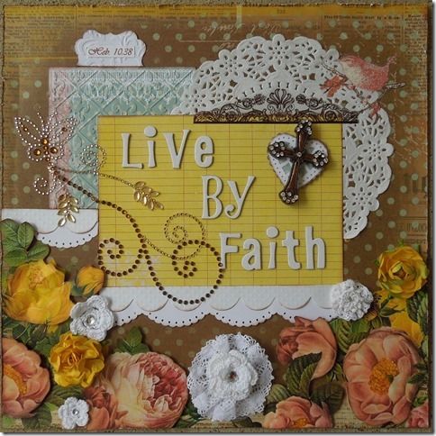
1


Heart- Under the cross
     Emboss- Blue pp, top journal piece and scallop
     Edges- Distressed, inked and scallops
     Typography- Scripture
     Fussy Cutting- Flowers and brown piece above heart
     No Photo

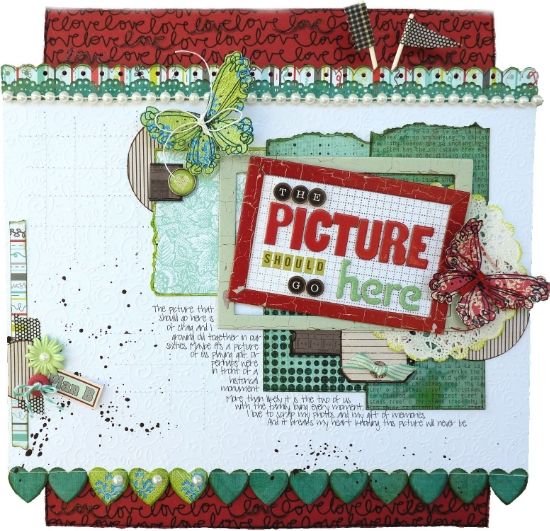
2


Hearts - I cut hearts, inked the edges, then adhered them as a 'decorative edge' along the bottom of my white paper. 

Typography - Used (4) different alpha's to create my title (in lieu of a photo). One of the paper strips behind my mat is a text paper.  The top and bottom red strip is an old Elsie 'love' script pattern. 

Fussy Cutting -  I used an old butterfly stamp I have to stamp onto patterned paper with Versamark.  Then I clear embossed the image. The butterflies were fussy cut.  Then I wrapped their 'body' with twine and tied them leaving long 'tails' to suggest antenna.  Cute, huh? 

Embossing - As I stated above, the butterflies were stamped and heat imbossed.  I highlighted the word love several times (on the red paper) with a glue pen, sprinkled them with clear embossing powder and heated them for added texture and dimension.   The white background paper is a heavily embossed pattern from Doodlebug. 

Edges - I started by making the red background narrower than the white layer. Then I distressed and outlined the edges.  Used (2) Fiskars border punches for the top strips above the white.  Glued a string of pearls to the top edge of the white. Tore and inked the edges of the layered papers behind my title.  Stitched the heart border to the bottom edge of the white in lieu of doing a scalloped edge.


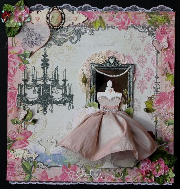
3


 HEARTS-- Crystal hearts on the EMBOSSED chipboard on the upper left, HEART on the neck of  the dress form
Liquid pearl heart beneath dress form, upper left Heart with typography on it- printed on hear vellum.
Edges- lace edges, inked edges, fussy cut edges of frame
Embossing- liquid embossing upper right damask and lower left--done in ombre fade effect- embossed frame upper left and embossed dress form
Typography-- stamped script in random spots and script on butterflies on left side of page, "Once upon a time" on upper left, Beauty on lower left


Beautiful ladies!  
Now everyone hurry back to the forum and cast your vote for your favorite layout - yep, only 1!


Monday, March 18, 2013

Welcome GDT Cheryl!


I was so excited to be asked to be the Guest DT at Memorable Seasons for the month of March!
I am really enjoying playing along with the great DT and awesome members.
After Amy & I decided to close ScrapFriendzy, as life just got entirely to busy for her, I really felt like a "Lost Scrapper"! LOL !!!!
I had been a member at MS for a while & popped in every now & then. But then I decided to jump in the "water" again and get to know everyone, and now it feels like home to me, thanks to the friendly DT ,encouraging members, and even some familiar SF members!
The kit I received was a mixture of these past papers.
It included:
5 sheets of C/S
1 sheet of Cosmo Cricket-Dandelion
1 Sheet basic Grey - Over blouse
1 sheet Bo Bunny - Chocolate Vintage
1 sheet Bo Bunny- Island Mist
1 sheet Crate Paper - Pretty Party
1 sheet Amy Tangerine - Cindy's sketch
1 sheet MME - Sunshine Lovely
1 sheet MME - Stella Rose "Love"
1 Studio Calico alphabet
And the great embellishments pictured below:


And here is what I created:


Thanks Cheryl for sharing your lovely work with us here at Memorable Seasons!  Make sure you stop by Cheryl's blog for more inspiration,  http://www.cherylllane.blogspot.com/ .

Friday, March 15, 2013

LSS #6 Challenge - Put it all Together

Wendy here, welcome to the final week of our Last Scrapper Standing contest! I've been thinking for 6 weeks what should be the final challenge, I would get one idea, then another, and then finally I settled on this one. I wanted to somehow incorporate everything we've been using the past few weeks, plus make it enough of a challenge so that someone rises to the top.

So the detail, (please read carefully they are a little different this week)...
1. You may not use any PHOTOS of any sort!
2. You must try to incorporate as many challenge items from the past 5 weeks as possible (hearts, embossing, edges, typography, fussy cutting).
3. Survivors, do not post your layout anywhere online, instead send your photo of your layout to me, anyone else that plays along, you may load your layouts just like normal. All layouts are due by March 20th 11:59pm.

And now, what did I create for this challenge???

Image

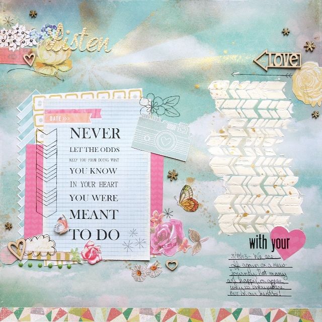
I chose to use a quote that is very important to my life right now as my main idea of the page, I then added in some heart elements, embossing on my wood veneers, edged my quote paper with paint and used a paper edge, I focused on my words on this page, I did a lot of fussy cutting which means I incorporated everything into my page!

Good luck everyone and have fun!

Thursday, March 7, 2013

Last Scrapper Standing #5 - Fussy Cutting!

Hello blog readers!  Susan here.  I'm presenting this week's Last Scrapper Challenge at Memorable Seasons and I'm so excited to see what all our participants come up with.

This week's challenge is a "FUSSY CUTTING" challenge.  What exactly is fussy cutting you ask?  Well, it's simply cutting things out of paper with a pair of scissors.  Like when you were a little kid and cut things out of magazines.  Remember doing that?  I'm sure we all did!  Grown up fussy cutting can add beautiful design elements to your page and can be so much fun!  You can cut whatever you want - flowers, leaves, vines, animals, objects, shapes, swirls....whatever your imagination can come up with.  You can cut these designs out of patterned paper, or make up your own designs from solid color card stock.  It's entirely up to you.

Here's my example.  I cut out the leaves and some of the flowers you see on the left and underneath the pictures. I layered them and popped some elements with dimensional adhesive.  There is so much you can do with fussy cutting to add your own look to your pages.  And a lot of people find it to be very relaxing to sit and cut things out.


I can't wait to see what everyone does with this challenge!


To enter this challenge, please...


  • Upload your NEW layout to the gallery and link it back to the Challenge #4 thread in the Last Scrapper Standing forum.
  • Have your layout posted by 03/13/13 at 11:59PM your local time.


Wednesday, March 6, 2013

Challenge #5 - stash

Wendy here to issue you a challenge to dig into your stash! This month the DT each received kits that were new to us, but was the store's stash. Lately I've been creating using just one manufacture, but this kit had me going out of my comfort zone. 

So my challenge to you is this, pull a few of your older papers from different manufacturers and create a layout, BUT ... I'd like you to also add in a few new touches. In my layout, I created my layout using my stash kit and then I added in a relatively new technique with the hexagons and I also added in some new products with the wood veneers and Polaroids.  So what can you create with your older stash if you add in a few pieces of spice?


Please create a new layout for this challenge.

Upload your layout to the gallery and link back here by March 31st for an entry into the prize drawing.

Tuesday, March 5, 2013

MOTM Marie


My name is Marie OHanlon. I live in Dublin, Ireland.  I am 46 years married to my husband Sé and we have four children Seán, Emmet, Ronan and Aisling.  We also have 10 grandchildren.    My grandchildren are the reason I scrap for as you will probably have noticed from my various layouts in the gallery. 

I really like being with Memorable Seasons and I must say they are a friendly bunch of ladies.  I have learned so much from being here and I thank you all for that. 

I love all the challenges especially the current one.  They really make me think outside the box  and do things I have never done before.

Thank you Memorable Seasons.


Here are a few of my favorite things.

Brian's Book I made for his First Holy Communion - It was from when he was born till he was 8.


Card book I made - I made cards to go into the pockets and each page has the month on it.


The layout is my son's wedding day.  I was on another forum years ago and it was highly commended and i was made a guest designer for a month. It brings back sweet memories to me.


We are so glad to have Marie with us, make sure you stop by the forum to scraplift her this month!

Monday, March 4, 2013

Join us for a technique challenge

Happy Monday, friends!  Over at the forum I challenged the members to join me in using a technique on their pages.  It's super hard, very difficult plus challenging! UH, NO!  It's simple -- and something most people can find in their stash -- STAMPING.

That's right, stamp on your pages!  Here's the page I made as an example using my March kit.


I used one stamp twice on this page -- it definitely added a little visual interest to the page.  It was not difficult and really gives the page a little extra something.  

Won't you come join us for the challenge?  All you have to do is make a new page specifically for this challenge and upload your layout to the gallery and link back to the challenge on the message board to have your name entered for the prize! 

Make it a great day! 


Sunday, March 3, 2013

March Challenge #2 - Tool

Hi Everyone!  It's Carol here issuing your 2nd challenge for March!  

What's a tool that we ALL have? It's not even a scrapbooking tool . . . it's more of an office supply! 

Why it's a STAPLER! My tool challenge is for you to pull out that stapler and have some fun! You can't beat the old reliable stapler for attaching everything and anything to your layout!

Take a look at my example:


Image

I used my much neglected Tim Holtz tiny attacher! I love this tool! Why don't I use it more often!?! I think I used 16 little staples on this layout! 

This challenge couldn't be any easier. Just use your stapler somewhere on your layout! That's it! 

Please create a new layout for this challenge.
Upload your layout to the gallery and link it back to the thread in the forum by March 31st for an entry into the prize drawing.

Have fun! 

Saturday, March 2, 2013

March Challenge 1 - Sketch

Good morning! I have this month's sketch which is from Pagemaps


Here is my example
Use the sketch as your inspiration and create a new layout. upload to the gallery and link to the sketch thread by March 31!

Have fun!

Friday, March 1, 2013

Last Scrapper Standing #4 - Just My Type!

Hello everyone! Megan here to issue you this week's Last Scrapper Standing challenge!

Letters, Fonts and Words...Oh My! Wherever you turn nowadays, typography seems to be front and center as "art." Subway art, chalkboard art...it's everywhere. And with so many cool fonts out there, why shouldn't it be?

So here's this week's challenge - create a layout in which typography is front and center. Meaning, the typography must be a major design element on your page.

Here's my example I created using my February Fancy Pants Love Note kit. I decided to go with the card featuring the alphabet that has "I {HEART} U" embedded in it. The alphabet serves as the big design feature on my page next to my photo and also the "I {HEART} U" serves as the title of my page.

And then I thought I'd also remind you of this layout I created for my two-page sketch tutorial back in December. On this layout, I used a variety of different alphas and embellished each word for creative title treatment; when I say “embellished” I mean that used brown Thickers for the word “brown”, covered the word “paper” with mulberry paper, put a package sticker behind the word “package”, etc.

I am so excited to see what you all create! Hopefully, you'll be able to find that right font, word or letter that screams to you, "That's just my type!"

To enter this challenge, please...
  • Upload your NEW layout to the gallery and link it back to the Challenge #4 thread in the Last Scrapper Standing forum.
  • Have your layout posted by 03/06/13 at 11:59PM your local time.